As soon as we open our eyes we encounter colors, from the colors of our interior to the colors we see through the window and which greatly affect our mood. When we talk about colors we mention warm and cool colors. Warm colors such as yellow, orange, and red give a feeling of warmth and comfort, but can sometimes also cause feelings of anger and rage. On the other hand, blue, green and purple evoke a feeling of peace, relaxation and sadness.
Colors are very important in the space in which we work because they affect our mood and our efficiency in work. They also affect people who come to the space as customers, clients, patients…
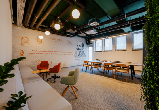
If we look at the green color, it gives a feeling of calm and peace and is most represented with the blue color in dental offices. Mostly light shades of these colors are used because they have a calming effect. Dark shades are not desirable because they can cause a feeling of sadness. Some studies have shown that employees are more productive in rooms whose walls are painted in these colors, and it is most desirable to use them in business premises where a lot of work is done on computers such as in IT companies and law firms. The green color in details such as various houseplants connects with nature and is very relaxing.
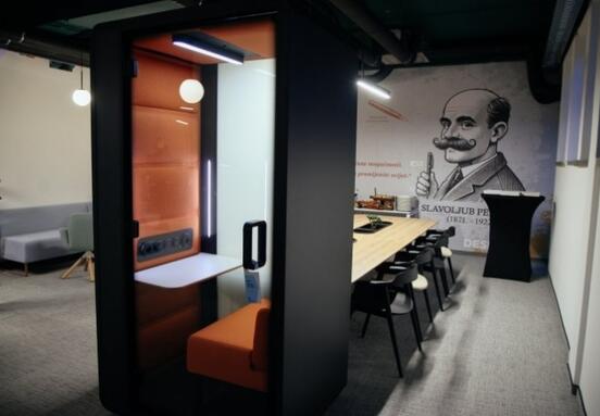
Warm colors such as red, yellow and orange are highly stimulating and stimulate brain activity. Yellow can be great for making important decisions and solving problems. It is recommended to use these colors in the interior in detail and not as some dominant color of most spaces as they could irritate and provoke anger and rage. So these colors can be found on one wall, in details such as the company logo on the wall, on individual pieces of furniture such as chairs or armchairs. They are most common in kindergartens and schools, precisely because of the stimulation and encouragement to learn and play.
Nowadays, black is widely used in the decoration of business premises as the dominant color of walls, lighting and details in combination with warm colors of wood. In such spaces, the details are usually in the color found in the company logo. The black color in the decoration gives the impression of mysticism and depth, and in combination with the warm colors a feeling of comfort. That is why these colors are used in the decoration of clubs and bars.
And in the end we cannot fail to mention white, for it is a symbol of purity and is rightly said to be colorless. It is always the main color when decorating most of the business premises on the walls, and in the furniture, it is accompanied by another significant color for a particular activity. As the dominant color of the interior, it is present in laboratories, hospitals and clinics, in spaces where the emphasis is on the sterility and cleanliness of the space.
In the end, we can say that depending on the work that a certain activity is engaged in, the dominant color of landscaping also depends, in order to properly influence employees and service users.
If you have questions for Andreja. Feel free to contact her on Linkedin or through her website.


